5 paint colors that are stressing you out
With our country in the grips of some life altering changes you may be feeling rather stressed. Just turning on the news or scrolling social media can raise your blood pressure and bring on a headache. Its been said repeatedly that our homes are our sanctuary and we should take the steps to actually make it feel like one. Now is the time to consider how your home’s colors may be adding to your anxiety. While you may have noticed that certain colors alter your mood, you may not realize that color affects your subconscious as well. Certain cultures use color to promote health and wellness. Known as chromotherapy, color and light are used to restore imbalances in a persons physical, mental, emotional or spiritual energy. Here are my tips on colors to avoid and the best alternatives if you want to create an oasis at home.
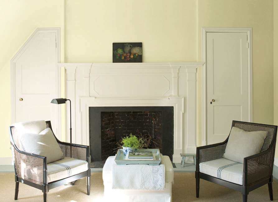
Yellow: Often associated with happiness, yellow can also activate the anxiety center of the brain. Bright yellows, especially neon shades, should be used sparingly as an accent. Try buttery, yellows that remind you of summer days or deep golds that connect you to a sense of the past.

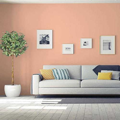
Red: Studies have shown red rooms increase our heart, respiration and blood pressure rates by activating the pituitary gland. Red is a showstopper, making it a powerful design tool for creating drama. Used in excess though it will inhibit relaxation and should be kept out spaces you want to chill out in. Shades of peach and coral will still stimulate creativity and interpersonal interactions without the revved up feeling associated with red.
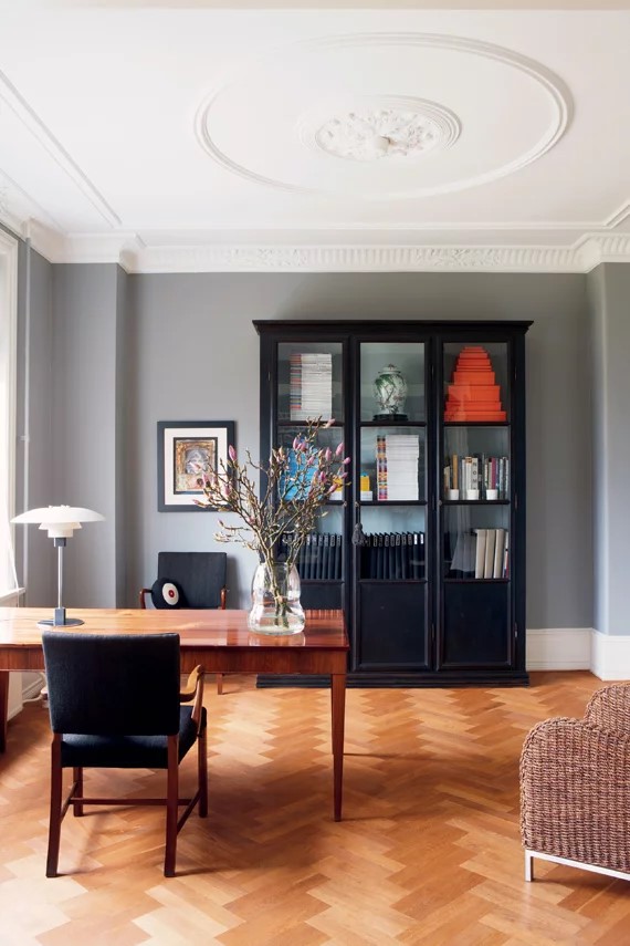
Black: Talk about dark and gloomy. While black rooms can be so chic, they will do little to make you feel uplifted day in and day out. Try instead cozy charcoal grays which can still feel dramatic though less oppressive than a true black.
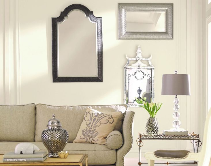
White: On the opposite end, stark white feels clinical and not at all relaxing. Opting for a warmer white, can still feel clean and modern while producing a relaxing vibe.
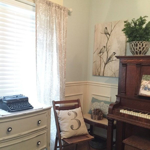
Green: Popular yellow greens make fantastic accent colors especially when combined with neutrals, however steer clear of these bright yellow greens as they can be mentally overwhelming. While green has been well documented as a relaxing color to be around, stick to softer tones that lean more blue green like Sherwin Williams “Sea Salt”
Mr. H says: Color can speak to the soul in many ways-Enjoy!