2016 Colors of the Year
It was once the exclusive domain of PANTONE to choose THE color of the year, being the world-renowned authority on color. That has evolved through the years with many of the major paint manufactures choosing there own “color of the year”.
These are the top picks for 2016.
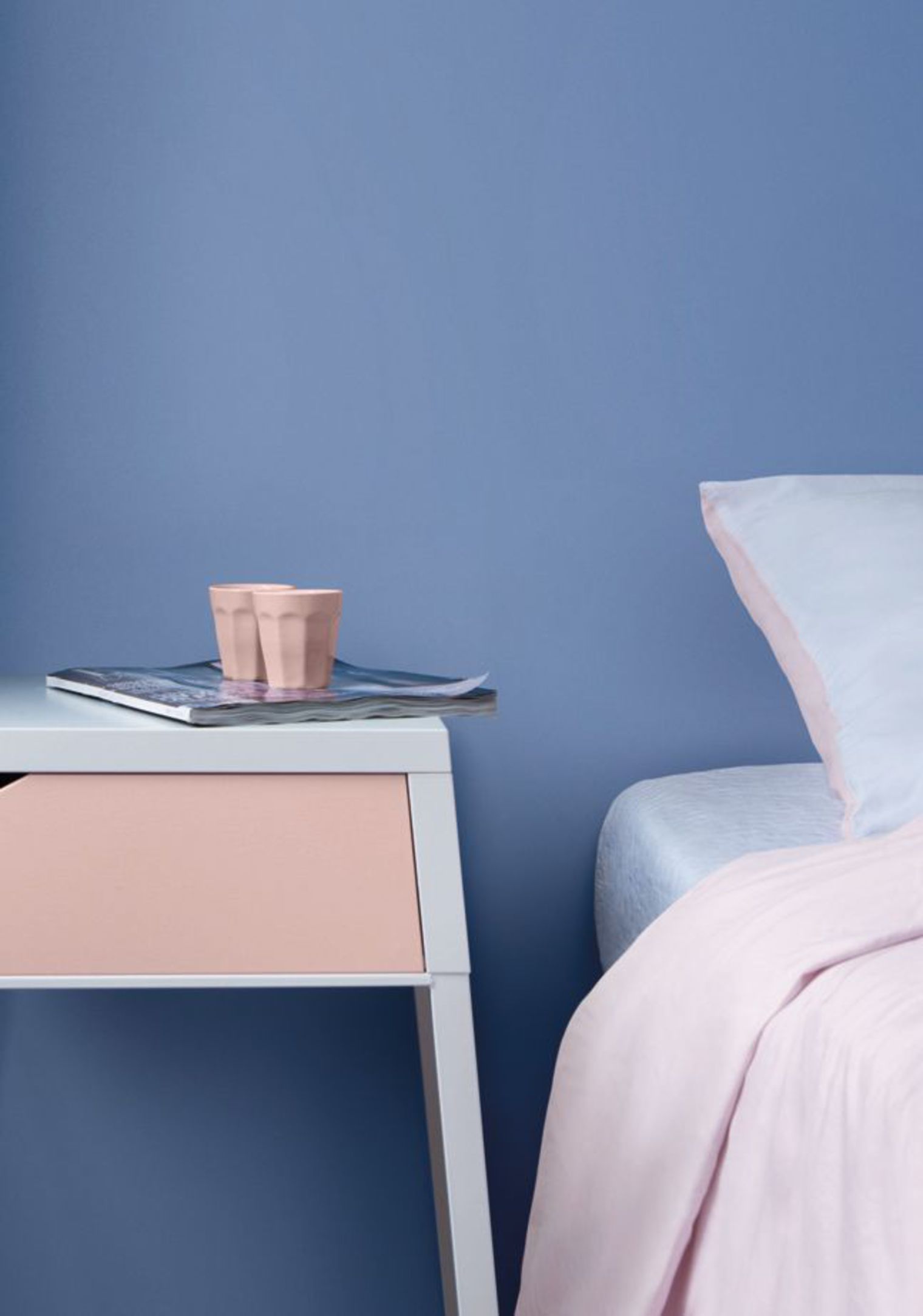
For the first time PANTONE selected two shades, Rose Quartz and Serenity as the PANTONE Color of the Year 2016. Rose Quartz is a persuasive yet gentle tone that conveys compassion and a sense of composure. Serenity is weightless and airy, like the expanse of the blue sky, bringing feelings of respite and relaxation even in turbulent times.
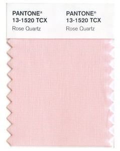
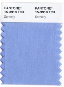
“As consumers seek mindfulness and well-being as an antidote to modern day stresses, welcoming colors that psychologically fulfill our yearning for reassurance and security are becoming more prominent. Joined together, Rose Quartz and Serenity demonstrate an inherent balance between a warmer embracing rose tone and the cooler tranquil blue, reflecting connection and wellness as well as a soothing sense of order and peace.”
A hue symbolic of new beginnings, Alabaster (SW 7008), is Sherwin-Williams 2016 Color of the Year. At a time of interconnected commotion and over stimulation, Alabaster offers a sense of personal solace and revival to weary minds.
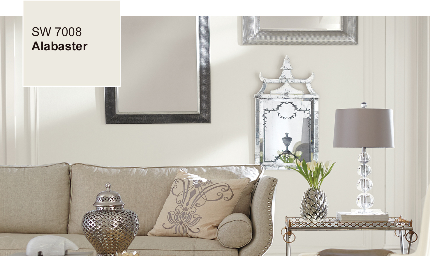
“Alabaster represents a straightforward and necessary shift to mindfulness. It provides an oasis of calmness, spirituality and ‘less is more’ visual relief. Alabaster is neither stark nor overly warm, but rather an understated and alluring white.”
Jackie Jordan, Sherwin-Williams director of color marketing.
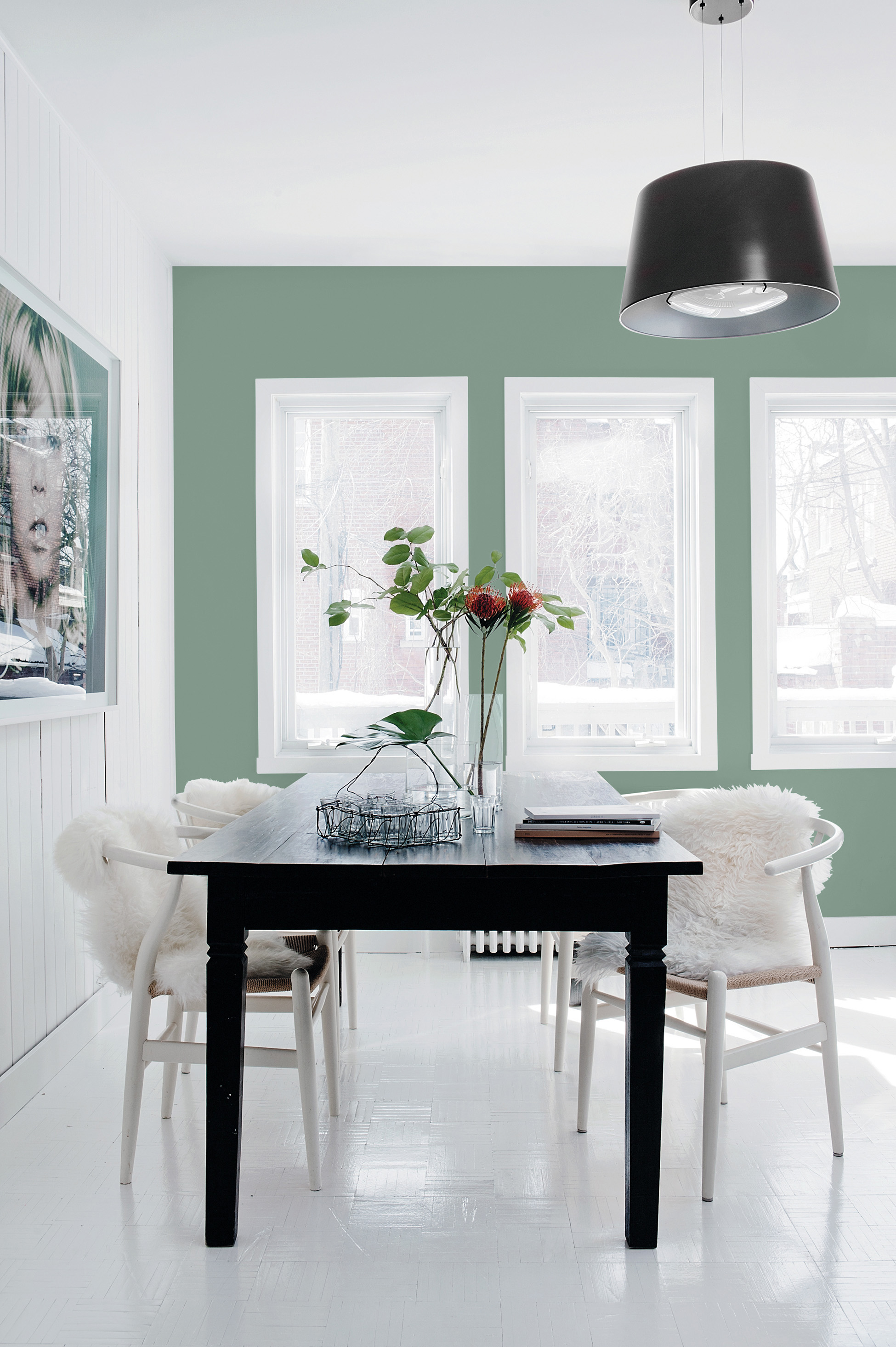
PPG has named “Paradise Found” as its 2016 Color of the Year. This organic, aloe green offers a subtle sense of ease and rejuvenation. It is a steadfast, impenetrable color that fulfill the need for sturdy reassurance against the worlds growing threats to global, national and cyber security.
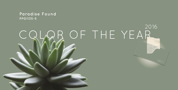
Paradise Found (PPG1135-5) is reminiscent of military fatigues and is found in the natural environment. It is a color that reflects our society’s focus on the development of personal strength, safety and security.
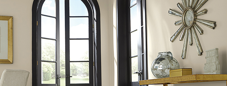
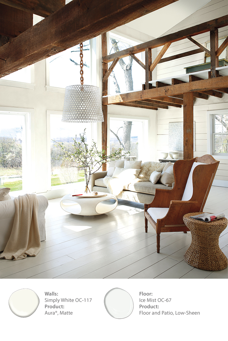
Benjamin Moore chose its 2016 color the year for its versatility. Simply White (OC-11) works equally well with cool or warm palettes and retains its neutrality, remaining as constant as possible under different light sources.
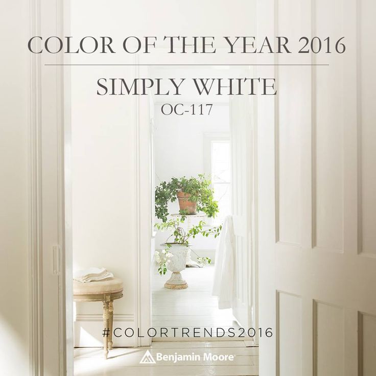
“The color white is transcendent, powerful and polarizing – it is either taken for granted or obsessed over,” says Ellen O’Neill, Benjamin Moore Creative Director. “White is not just a design trend, it is a design essential. The popularity of white, the necessity of white, the mystique of white is quantifiable in our industry. Of the top ten best-selling Benjamin Moore colors, variants of white occupy five spots. It was inevitable that we would ultimately recognize white as our Color of the Year.”
Mr. H says: Color is the place where our brain and the universe meet-Enjoy!